A Taste of Legacy, a Logo of Love
The Calling
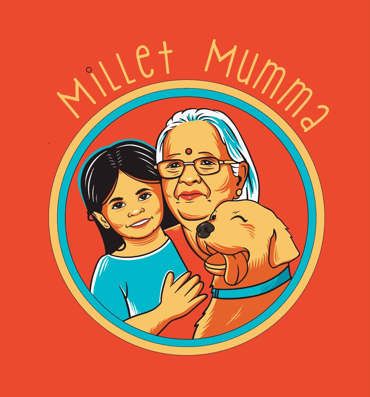
Millet Mumma wasn’t just a bakery—it was a tribute. The founder wanted to honour the three living symbols of her strength and softness: her mother, her daughter, and her dog. She didn’t want a logo; she wanted a legacy sealed in colour and curves.
So we asked:
How do you bake memory into design?
The Cosmic Convergence
We approached this project like an alchemist approaches gold: patiently, personally, and with reverence.
-
Tapped into the emotional essence of the brand.
-
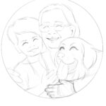
Illustrated the trio—matriarch, child, canine—to bring the story to life.
-
Chose a vintage-meets-modern style: bold lines, warm hues, a touch of whimsy.
-
Wove the brand language with love and laughter, reflecting nourishment beyond nutrition.
The Manifestation
Logo Design:
An illustrated portrait of three generations—crafted with joyful strokes and an embrace that speaks louder than words.
Typography & Color:
-
Rounded, soft typeface spelling “Millet Mumma” in an inviting arc.
-
Earthy reds and turmeric golds echo hearth and heritage.
-
Teal accents bring balance and a dash of modern freshness.
Tone of Voice:
Playful, grounded, and maternal. Think:
“Wholesome with a wag.”
“Ancient grains. Modern mumma energy.”
The Shift
-
A brand identity that resonates instantly—homely yet distinct.
-
The founder said she felt “seen, rooted, and proud.”
The Ripple Effect
Millet Mumma became more than a bakery.
It became a story. A smile. A moment of shared memory.
At Dmiurgik, we don’t just design logos. We distil soul into symbols.